Finding similar products on Amazon
Client
Amazon
Year
2014
Role
Lead Designer
The Fabulous app was created to help customers find the exact shoes they want from Amazon's extensive shoe collection. Using visual recognition technology, it brought together the power of exploring shoes by visual similarity and the convenience of shopping on Amazon. The app suffered from low adoption and part of my goal was to find out why and design a more inviting experience and drive traffic to Amazon. I was the UX, UI, and brand designer and I worked closely with a team of very talented engineers, developers and managers.
Research
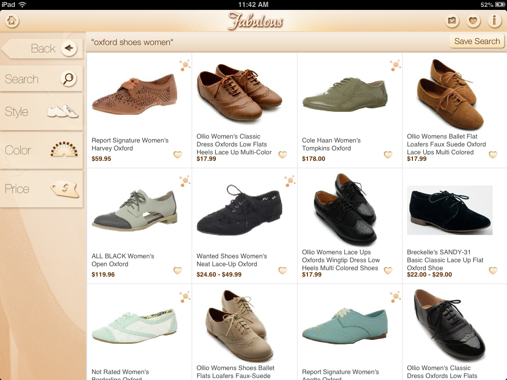
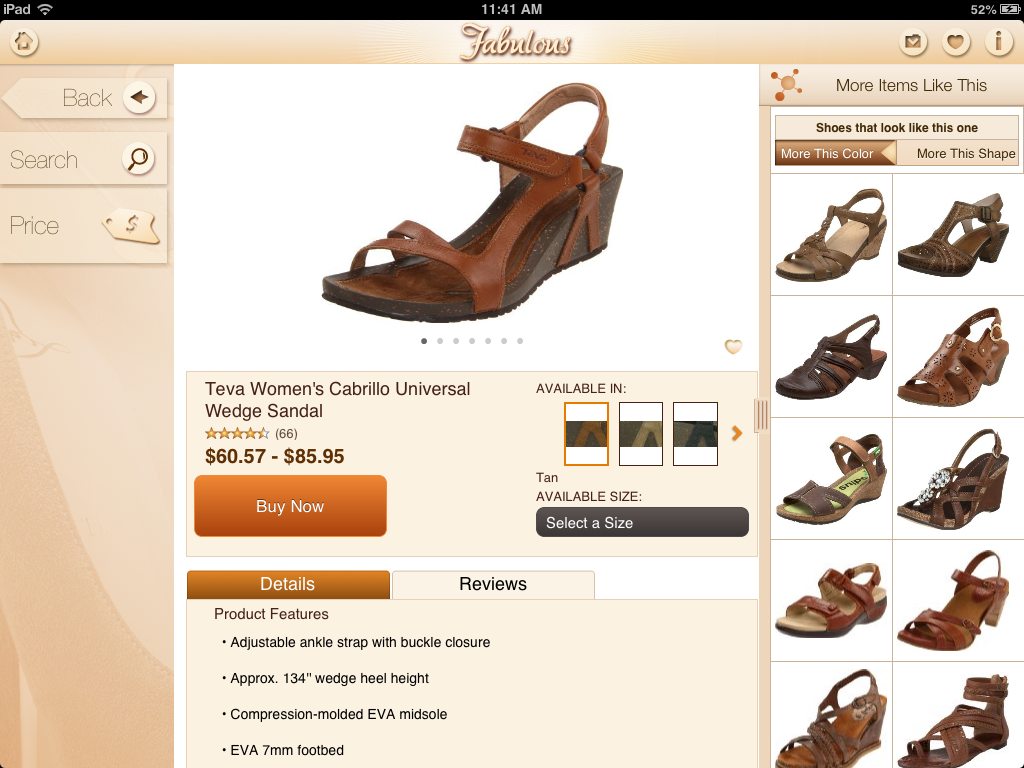
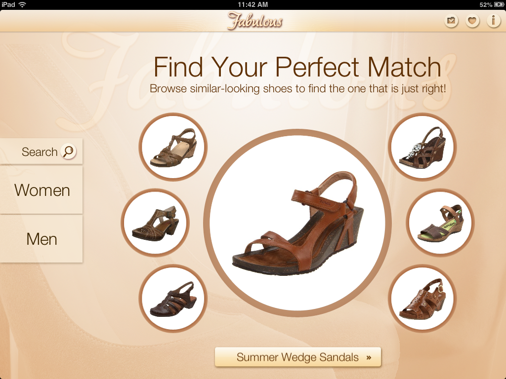
In the app, customers had to first find the shoe that had attributes they liked, and then they were presented with shoes from Amazon in similar shapes and colors.
To get a better sense of the key problem areas and opportunities, I conducted surveys and users tests with new and returning users. Through this process, I discovered that the experience was geared towards a very specific user - people who were looking to buy shoes based on visual similarity. It wasn't inviting to regular shoe shoppers due to a lack of proper browse and discovery. Even for the specific users, the interface was overwhelming and confusing and did not create a smooth shopping experience. I combed through different user journeys to pinpoint some of the other disconnects in the interaction and experience of the app.
Next, I researched the fashion app market to get a better sense of Fabulous’ competitors, customers, and trends in design and shopping. During a time when all of the competitors provided personalized and curated products to a variety of users, Fabulous was limiting itself by unintentionally focusing purely on women with a very specific sense of style. The collections were not curated or personalized in any way, which meant that the chances of a user associating themselves with the presented product were slim. With all this in mind, I re-created user personas and user journeys to better represent the ideal user experience.
The new app would have to appeal to a larger audience by showcasing a more curated and eclectic set of shoe styles.
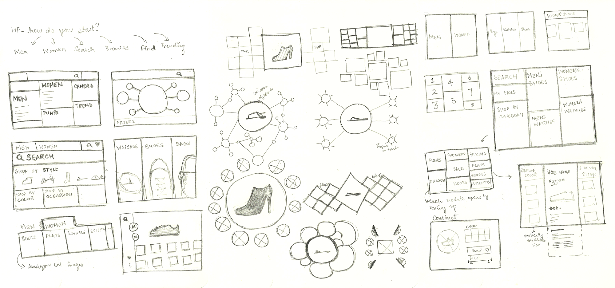
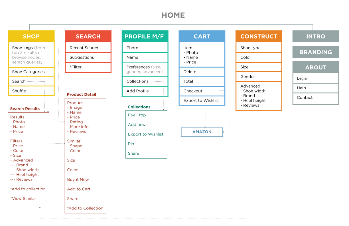
From there I went on to restructure the app and simplify the content on each screen. After multiple iterations and testing of layouts and interactions, we had our re-designed app ready. Below you will find some snippets from the re-design.
Branding
The name Fabulous was changed to Flow Fashion as a way of unifying with A9’s Flow app and also giving a better idea of the app’s primary content. The old visual language consisted of a heavy, skeuomorphic interface that created unintuitive, distracting visuals where users were unable to differentiate between function and decoration. The new design introduced a more minimal interface with clean and consistent typography to make it simple, fashionable and approachable. Branding was kept to a minimum so as to let the products take center stage and dictate the visual language of the app. The more users filtered and customized it with shoes of their choosing, the more the app looked like it was made exclusively for them. Kind of like walking into a store that only carries your shoe size and styles.
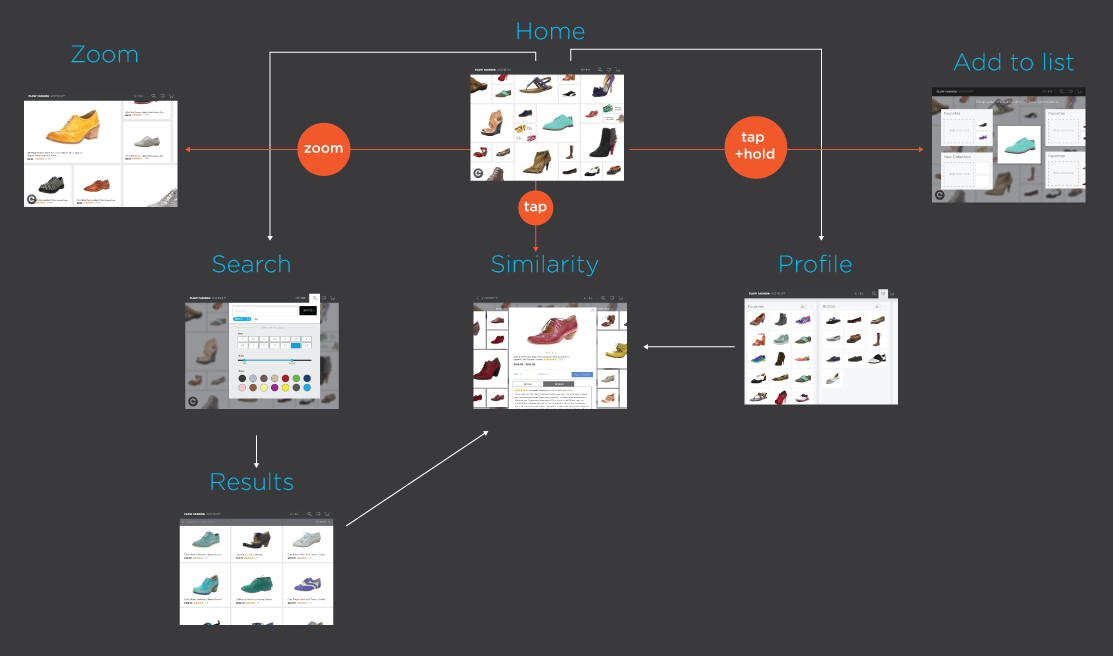
The home screen
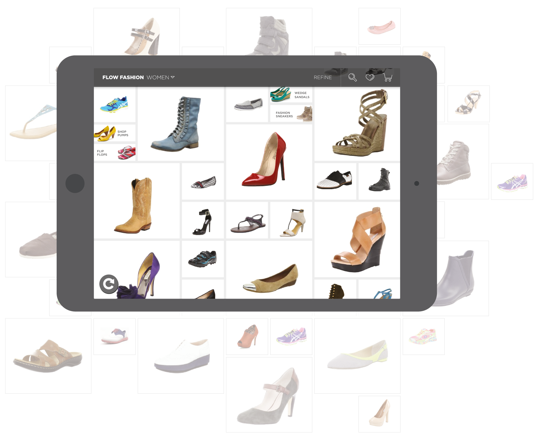
The old app gave the user 3 ways to dive into the products - they could pick one of the seven featured shoes, use the search tool or drill down from the Men/Women category. While the first option was oddly specific, the latter two were so broad that users had to come prepared with a specific product and spend some time drilling down results to find it. Due to the limitations, this provided, I started to brainstorm ways to increase the number of entry points so it would cater to a wider audience.
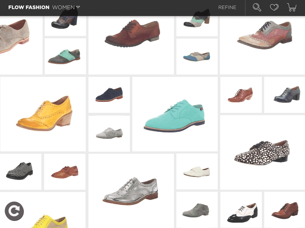
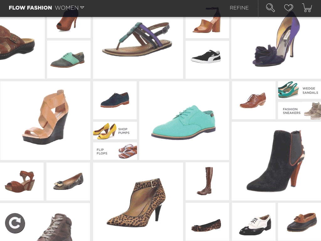
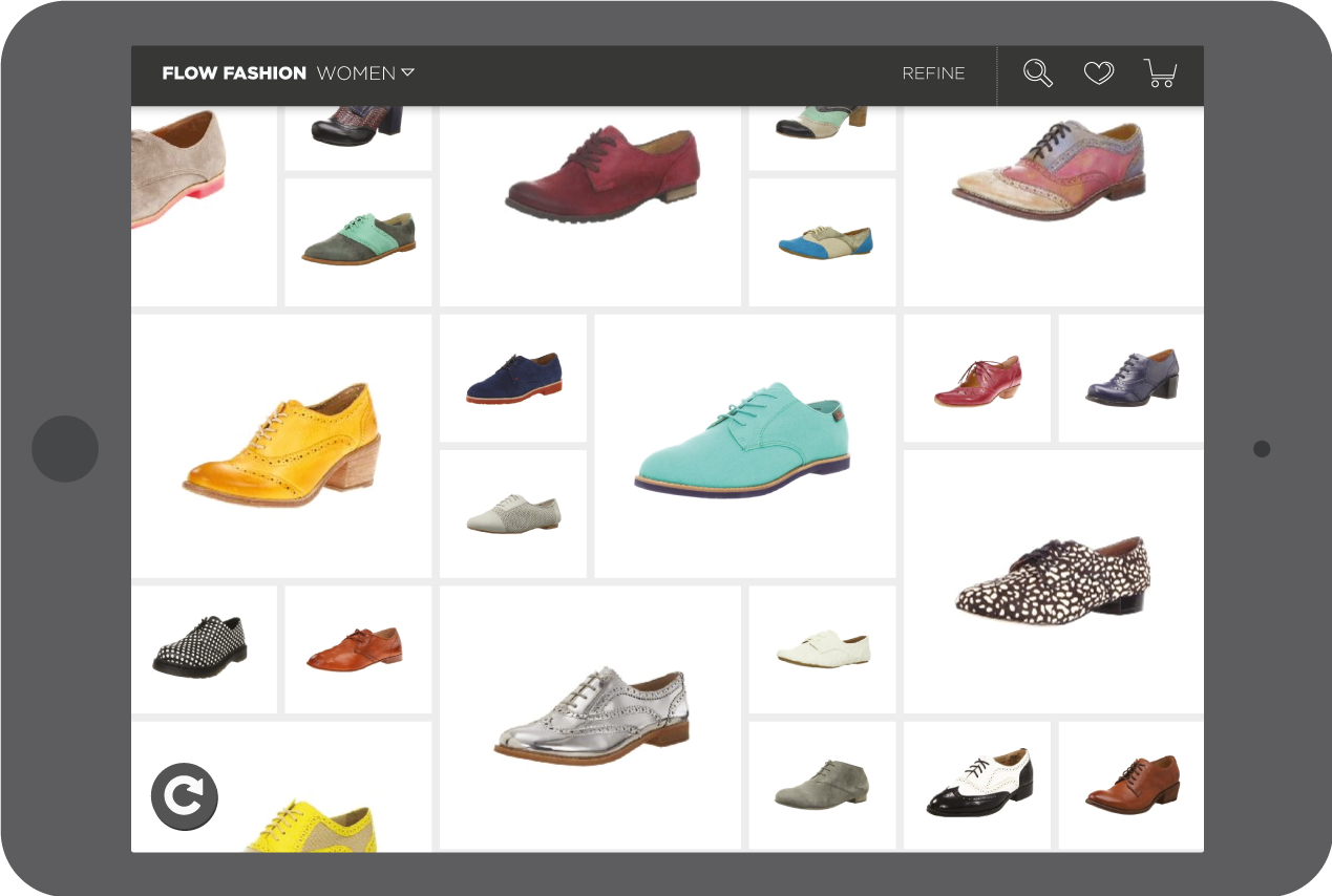
As part of the redesign, I decided to change the ratio of product to UI elements drastically. The user is greeted into the app with a large grid of shoes with varying styles curated from Amazon Fashion and Amazon’s highest-rated shoes.
The large grid acts as a way to browse and discover casually by swiping in any direction and getting the user started in a quicker way. It was built to accommodate other categories in the future like bags and watches. The grid also helped with the app's responsiveness on different devices. The categories were moved to the top where users can quickly scroll through and find categories and sub-categories.
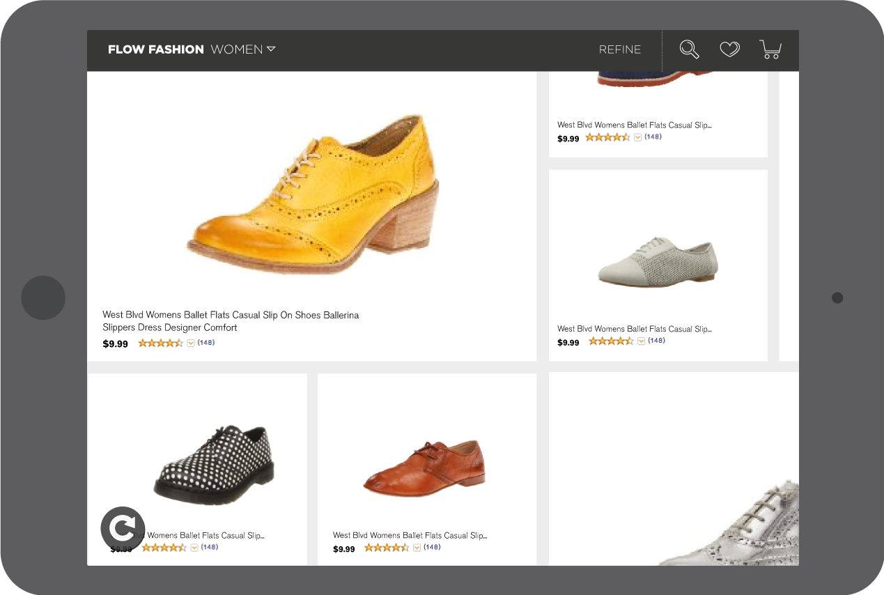
The user can simply zoom in to see more information about a shoe and pinch to go back to the regular view. This was a way of providing just the right amount of information at any given time while responding to user intent.
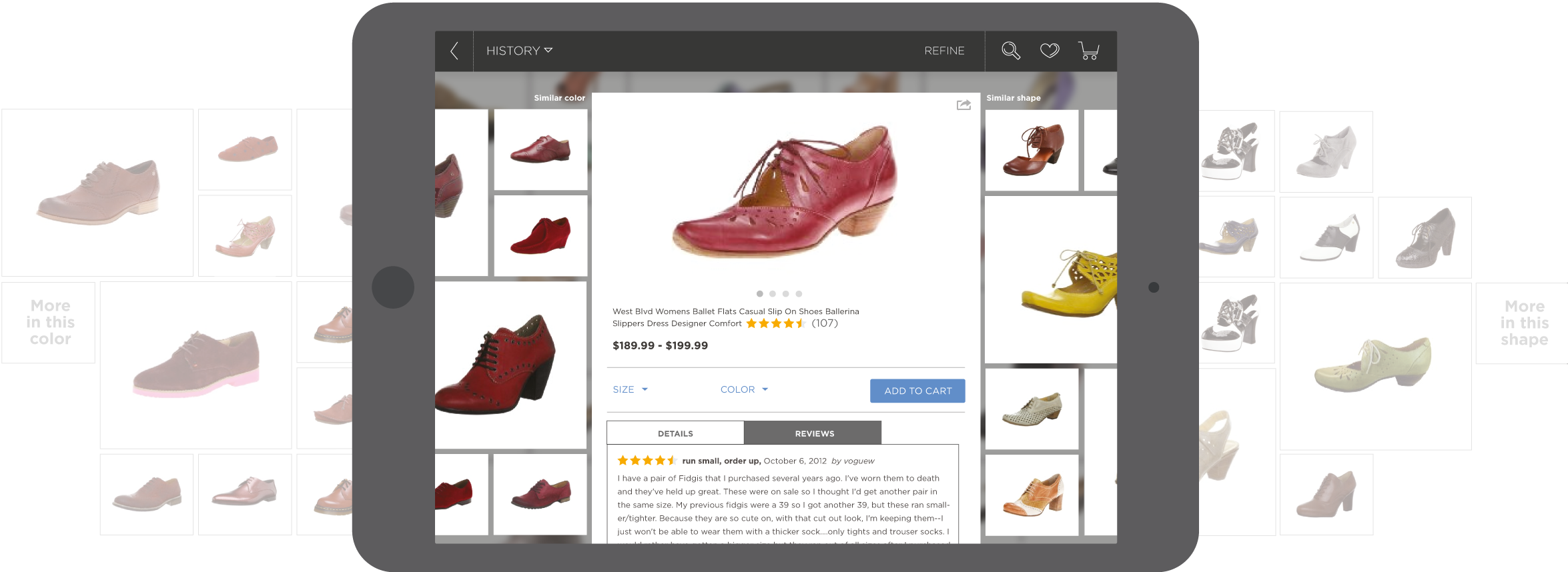
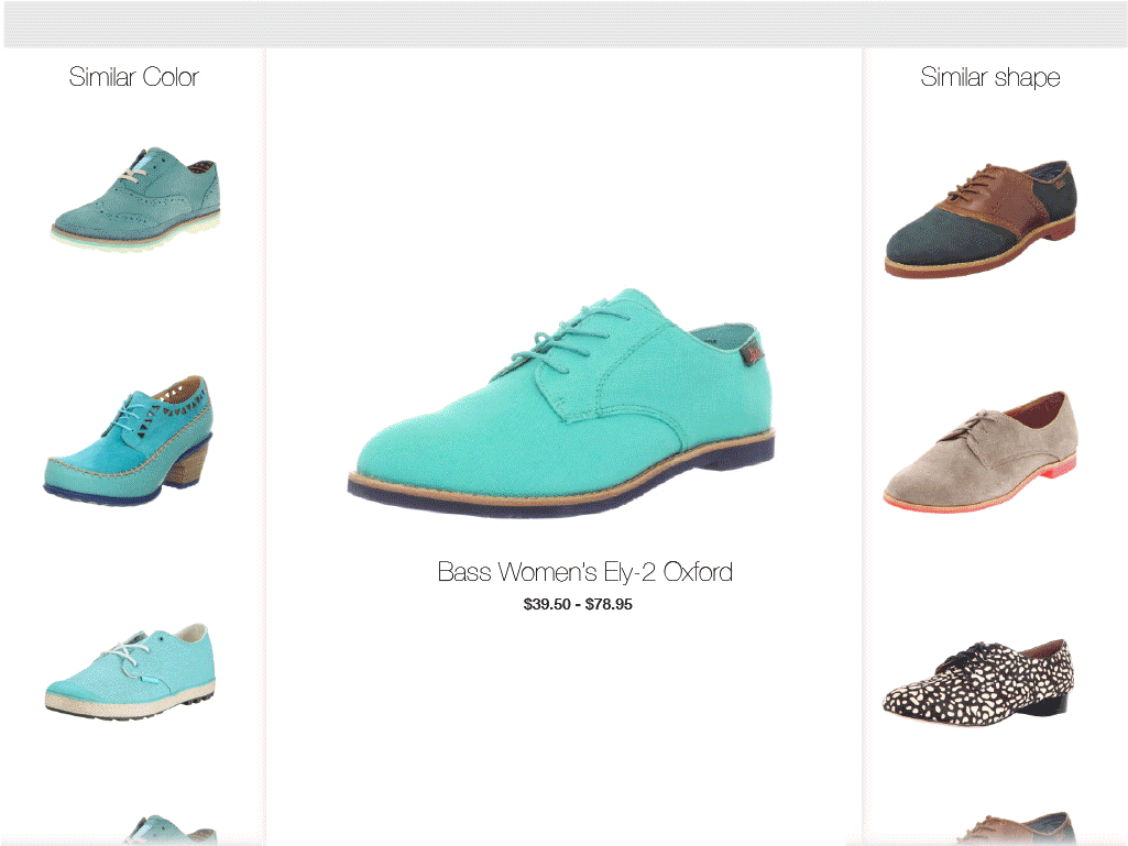
Similarity
The old Fabulous displayed its visually similar shoes on the right-hand side where visibility was lost due to the small scale and interface clutter. In the re-designed version, I took advantage of horizontal and vertical scrolling by using product info on the Y-axis and similarities on the X-axis. Shoes of similar shapes were on the left and similar shapes on the right.
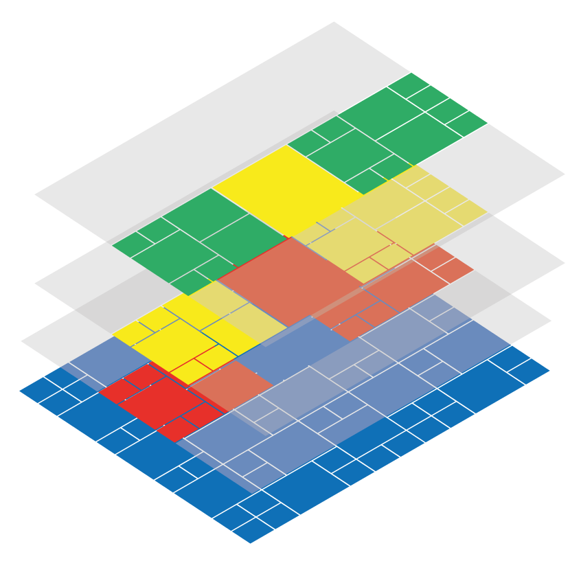
Layers
The similarity overlay would appear anytime the user selects a shoe from anywhere in the app. It was displayed as a layer above the grid and the user could pivot off the similarities to build further layers. A simple tap outside each layer would take the user back one step, thus finding their way back with easy navigation.
Explore more projects
Designing for Privacy - MySudoApp Design
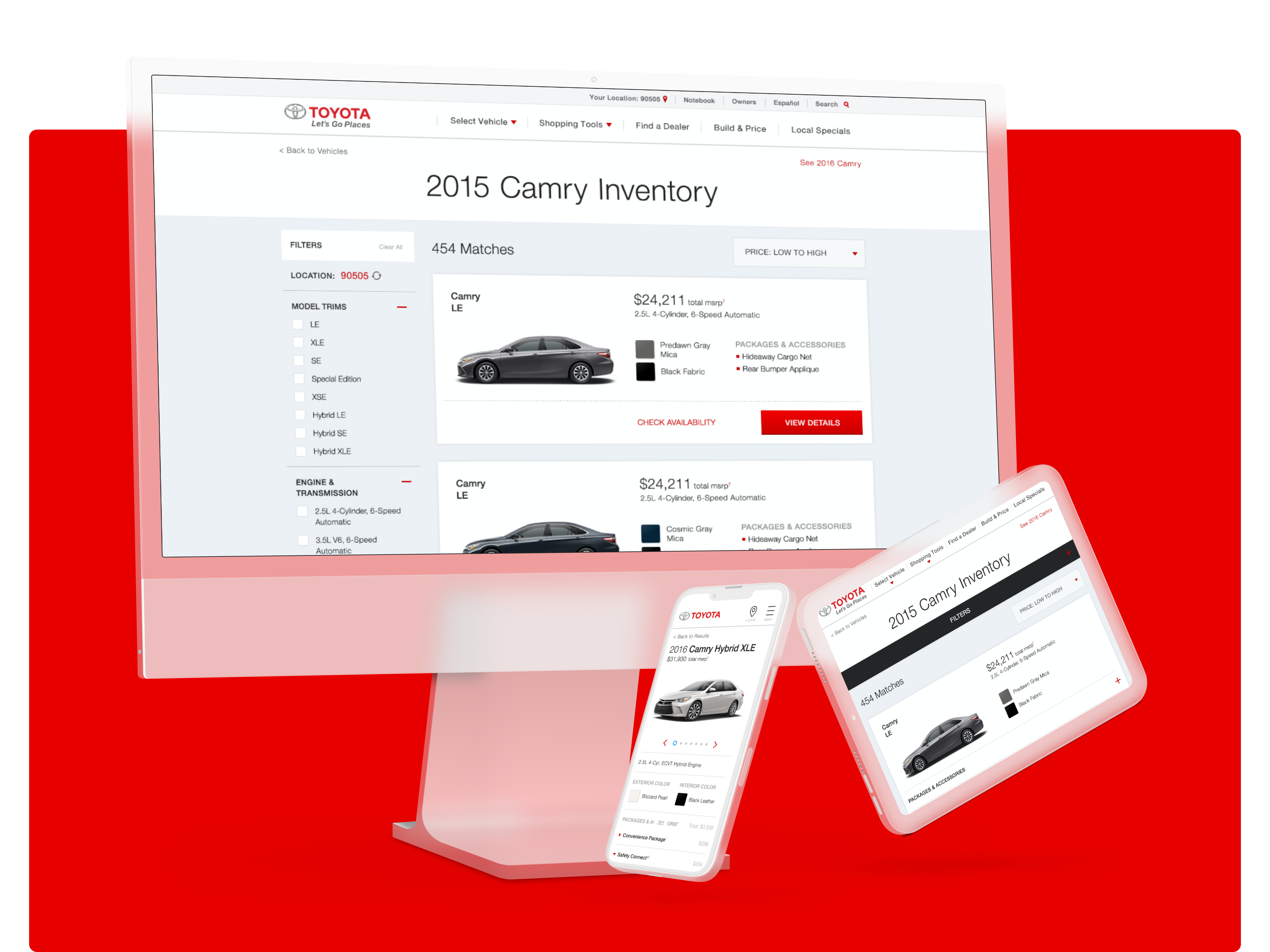
Finding your next car in the Toyota InventoryApp & Website Design, UX, UI, Creative Direction
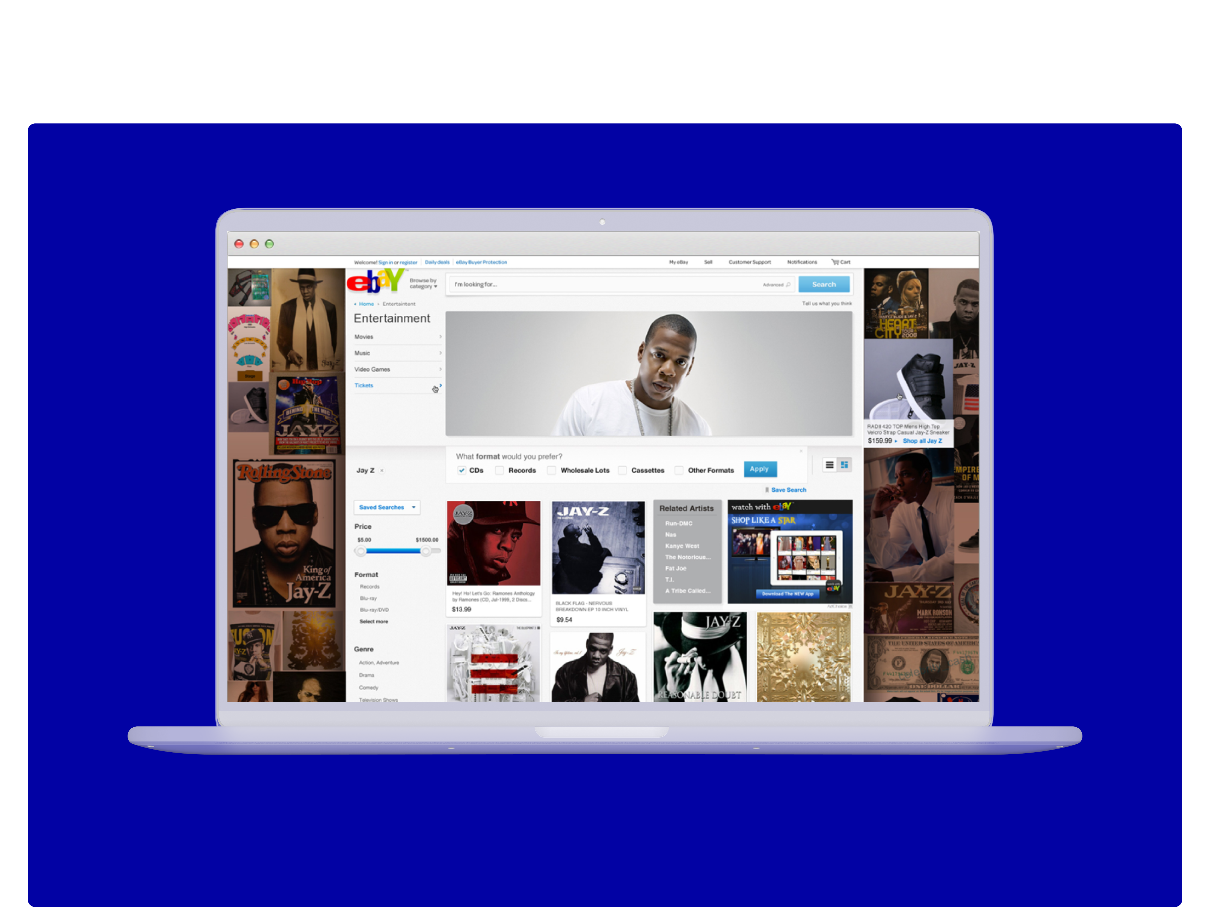
Designing a more engaging eBay feed experienceUX/ UI Design
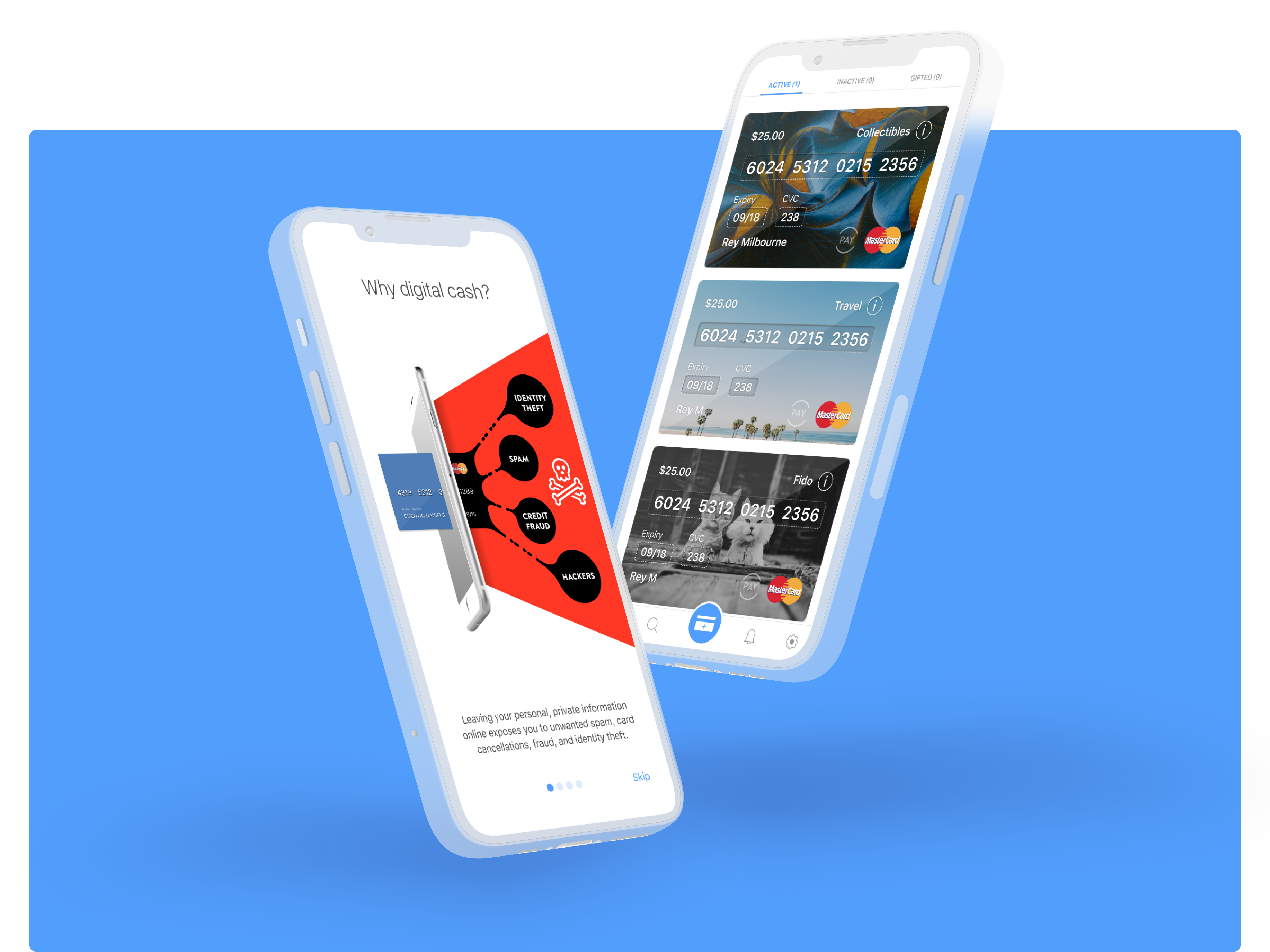
Secure payment experiences with SudoPayProduct Design, Creative Direction
Recapturing the StructionSite BrandBranding, Creative Direction, product Design